#include <ttauri/widgets/label_widget.hpp>
Inheritance diagram for tt::label_widget:

Public Types | |
| using | super = widget |
Public Member Functions | |
| template<typename Label , typename Alignment = tt::alignment, typename TextStyle = tt::theme_text_style> | |
| label_widget (gui_window &window, widget *parent, Label &&label, Alignment &&alignment=alignment::middle_right, TextStyle &&text_style=theme_text_style::label) noexcept | |
| Construct a label widget. | |
 Public Member Functions inherited from tt::widget Public Member Functions inherited from tt::widget | |
| widget (gui_window &window, widget *parent) noexcept | |
| widget (const widget &)=delete | |
| widget & | operator= (const widget &)=delete |
| widget (widget &&)=delete | |
| widget & | operator= (widget &&)=delete |
| virtual void | deinit () noexcept |
| Should be called right after allocating and constructing a widget. | |
| virtual float | margin () const noexcept |
| Get the margin around the Widget. | |
| extent2 | minimum_size () const noexcept |
| Minimum size. | |
| extent2 | preferred_size () const noexcept |
| Preferred size. | |
| extent2 | maximum_size () const noexcept |
| Maximum size. | |
| void | set_layout_parameters (geo::transformer auto const &local_to_parent, extent2 size, aarectangle const &clipping_rectangle) noexcept |
| Set the location and size of the widget inside the window. | |
| void | set_layout_parameters_from_parent (aarectangle child_rectangle, aarectangle parent_clipping_rectangle, float draw_layer_delta) noexcept |
| void | set_layout_parameters_from_parent (aarectangle child_rectangle) noexcept |
| matrix3 | parent_to_local () const noexcept |
| matrix3 | local_to_parent () const noexcept |
| matrix3 | window_to_local () const noexcept |
| matrix3 | local_to_window () const noexcept |
| extent2 | size () const noexcept |
| float | width () const noexcept |
| float | height () const noexcept |
| aarectangle | rectangle () const noexcept |
| Get the rectangle in local coordinates. | |
| virtual float | base_line () const noexcept |
| Return the base-line where the text should be located. | |
| aarectangle | clipping_rectangle () const noexcept |
| virtual hitbox | hitbox_test (point2 position) const noexcept |
| Find the widget that is under the mouse cursor. | |
| virtual bool | accepts_keyboard_focus (keyboard_focus_group group) const noexcept |
| Check if the widget will accept keyboard focus. | |
| virtual color | background_color () const noexcept |
| virtual color | foreground_color () const noexcept |
| virtual color | focus_color () const noexcept |
| virtual color | accent_color () const noexcept |
| virtual color | label_color () const noexcept |
| virtual void | draw (draw_context context, hires_utc_clock::time_point display_time_point) noexcept |
| Draw the widget. | |
| virtual void | request_redraw () const noexcept |
| virtual bool | handle_event (command command) noexcept |
| Handle command. | |
| virtual bool | handle_event (std::vector< command > const &commands) noexcept |
| virtual bool | handle_command_recursive (command command, std::vector< widget const * > const &reject_list) noexcept |
| Handle command recursive. | |
| virtual bool | handle_event (mouse_event const &event) noexcept |
| virtual bool | handle_event (keyboard_event const &event) noexcept |
| Handle keyboard event. | |
| virtual widget const * | find_next_widget (widget const *current_keyboard_widget, keyboard_focus_group group, keyboard_focus_direction direction) const noexcept |
| Find the next widget that handles keyboard focus. | |
| widget const * | find_first_widget (keyboard_focus_group group) const noexcept |
| widget const * | find_last_widget (keyboard_focus_group group) const noexcept |
| bool | is_first (keyboard_focus_group group) const noexcept |
| Is this widget the first widget in the parent container. | |
| bool | is_last (keyboard_focus_group group) const noexcept |
| Is this widget the last widget in the parent container. | |
| virtual void | scroll_to_show (tt::rectangle rectangle) noexcept |
| Scroll to show the given rectangle on the window. | |
| std::vector< widget const * > | parent_chain () const noexcept |
| Get a list of parents of a given widget. | |
| void | clear () noexcept |
| Remove and deallocate all child widgets. | |
| widget & | add_widget (std::unique_ptr< widget > widget) noexcept |
| Add a widget directly to this widget. | |
Data Fields | |
| observable< label > | label |
| The label to display. | |
| observable< alignment > | alignment = alignment::middle_right |
| How the label and icon are aligned. | |
| observable< theme_text_style > | text_style = theme_text_style::label |
| The text style to display the label's text in and color of the label's (non-color) icon. | |
| Data Fields inherited from tt::widget | |
| gui_window & | window |
| Convenient reference to the Window. | |
| widget *const | parent |
| Pointer to the parent widget. | |
| std::string | id |
| A name of widget, should be unique between siblings. | |
| observable< bool > | enabled = true |
| The widget is enabled. | |
| observable< bool > | visible = true |
| The widget is visible. | |
| float | draw_layer |
| The draw layer of the widget. | |
| int | semantic_layer |
| The draw layer of the widget. | |
| int | logical_layer |
| The logical layer of the widget. | |
Detailed Description
The GUI widget displays and lays out text together with an icon.
This widget is often used by other widgets. For example checkboxes display a label representing their state next to the checkbox itself.
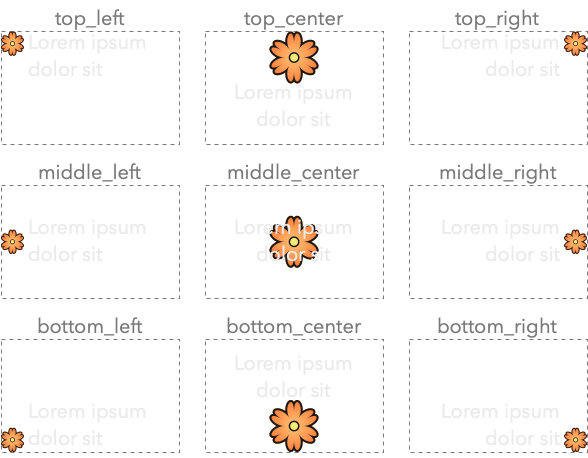
The alignment of icon and text is shown in the following image:
Here is an example on how to create a label:
Constructor & Destructor Documentation
◆ label_widget()
template<typename Label , typename Alignment = tt::alignment, typename TextStyle = tt::theme_text_style>
|
inlinenoexcept |
Construct a label widget.
- See also
label_widget::alignment
- Parameters
-
window The window that this widget belongs to. parent The parent widget that owns this radio button widget. label The label to show next to the radio button. alignment The alignment of the label. The default alignment is middle_right, because the most common usage for a label by an application programmer is to add the label to the left of another widget. text_style The text style of the label, and color of non-color icons.
Field Documentation
◆ alignment
| observable<alignment> tt::label_widget::alignment = alignment::middle_right |
How the label and icon are aligned.
Different layouts:
alignment::top_left: icon and text are inline with each other, with the icon in the top-left corner.alignment::top_right: icon and text are inline with each other, with the icon in the top-right corner.alignment::middle_left: icon and text are inline with each other, with the icon in the middle-left.alignment::middle_right: icon and text are inline with each other, with the icon in the middle-right.alignment::bottom_left: icon and text are inline with each other, with the icon in the bottom-left.alignment::bottom_right: icon and text are inline with each other, with the icon in the bottom-right.alignment::top_center: Larger icon above the text, both center aligned.alignment::bottom_center: Larger icon below the text, both center aligned.alignment::middle_center: text drawn across a large icon. Should only be used with apixmapicon.
◆ label
| observable<label> tt::label_widget::label |
The label to display.
◆ text_style
| observable<theme_text_style> tt::label_widget::text_style = theme_text_style::label |
The text style to display the label's text in and color of the label's (non-color) icon.
The documentation for this class was generated from the following file:
- hikogui/src/ttauri/widgets/label_widget.hpp