#include <ttauri/widgets/toolbar_tab_button_widget.hpp>
Public Types | |
| using | super = abstract_button_widget |
| using | delegate_type = typename super::delegate_type |
| using | callback_ptr_type = typename delegate_type::callback_ptr_type |
 Public Types inherited from tt::abstract_button_widget Public Types inherited from tt::abstract_button_widget | |
| using | super = widget |
| using | delegate_type = button_delegate |
| using | callback_ptr_type = typename delegate_type::callback_ptr_type |
Public Member Functions | |
| template<typename Label > | |
| toolbar_tab_button_widget (gui_window &window, widget *parent, Label &&label, std::weak_ptr< delegate_type > delegate) noexcept | |
| Construct a toolbar tab button widget. | |
| template<typename Label , typename Value , typename... Args> requires (not std::is_convertible_v<Value, weak_or_unique_ptr<delegate_type>>) | |
| toolbar_tab_button_widget (gui_window &window, widget *parent, Label &&label, Value &&value, Args &&...args) noexcept | |
| Construct a toolbar tab button widget with a default button delegate. | |
| Public Member Functions inherited from tt::abstract_button_widget | |
| template<typename Label > | |
| void | set_label (Label const &rhs) noexcept |
| Set on/off/other labels of the button to the same value. | |
| button_state | state () const noexcept |
| Get the current state of the button. | |
| template<typename Callback > | |
| callback_ptr_type | subscribe (Callback &&callback) noexcept |
| Subscribe a callback to call when the button is activated. | |
| void | unsubscribe (callback_ptr_type &callback_ptr) noexcept |
| Unsubscribe a callback. | |
| Public Member Functions inherited from tt::widget | |
| widget (gui_window &window, widget *parent) noexcept | |
| widget (const widget &)=delete | |
| widget & | operator= (const widget &)=delete |
| widget (widget &&)=delete | |
| widget & | operator= (widget &&)=delete |
| bool | is_gui_thread () const noexcept |
| tt::theme const & | theme () const noexcept |
| Get the theme. | |
| tt::font_book & | font_book () const noexcept |
| Get the font book. | |
| virtual float | margin () const noexcept |
| Get the margin around the Widget. | |
| extent2 | minimum_size () const noexcept |
| Minimum size. | |
| extent2 | preferred_size () const noexcept |
| Preferred size. | |
| extent2 | maximum_size () const noexcept |
| Maximum size. | |
| void | set_layout_parameters (geo::transformer auto const &local_to_parent, extent2 size, aarectangle const &clipping_rectangle) noexcept |
| Set the location and size of the widget inside the window. | |
| void | set_layout_parameters_from_parent (aarectangle child_rectangle, aarectangle parent_clipping_rectangle, float draw_layer_delta) noexcept |
| void | set_layout_parameters_from_parent (aarectangle child_rectangle) noexcept |
| matrix3 | parent_to_local () const noexcept |
| matrix3 | local_to_parent () const noexcept |
| matrix3 | window_to_local () const noexcept |
| matrix3 | local_to_window () const noexcept |
| extent2 | size () const noexcept |
| float | width () const noexcept |
| float | height () const noexcept |
| aarectangle | rectangle () const noexcept |
| Get the rectangle in local coordinates. | |
| virtual float | base_line () const noexcept |
| Return the base-line where the text should be located. | |
| aarectangle | clipping_rectangle () const noexcept |
| virtual color | foreground_color () const noexcept |
| virtual color | focus_color () const noexcept |
| virtual color | accent_color () const noexcept |
| virtual color | label_color () const noexcept |
| virtual bool | handle_event (std::vector< command > const &commands) noexcept |
| virtual bool | handle_command_recursive (command command, std::vector< widget const * > const &reject_list) noexcept |
| Handle command recursive. | |
| virtual bool | handle_event (keyboard_event const &event) noexcept |
| Handle keyboard event. | |
| virtual widget const * | find_next_widget (widget const *current_keyboard_widget, keyboard_focus_group group, keyboard_focus_direction direction) const noexcept |
| Find the next widget that handles keyboard focus. | |
| widget const * | find_first_widget (keyboard_focus_group group) const noexcept |
| widget const * | find_last_widget (keyboard_focus_group group) const noexcept |
| bool | is_first (keyboard_focus_group group) const noexcept |
| Is this widget the first widget in the parent container. | |
| bool | is_last (keyboard_focus_group group) const noexcept |
| Is this widget the last widget in the parent container. | |
| virtual void | scroll_to_show (tt::rectangle rectangle) noexcept |
| Scroll to show the given rectangle on the window. | |
| std::vector< widget const * > | parent_chain () const noexcept |
| Get a list of parents of a given widget. | |
| void | clear () noexcept |
| Remove and deallocate all child widgets. | |
| widget & | add_widget (std::unique_ptr< widget > widget) noexcept |
| Add a widget directly to this widget. | |
Additional Inherited Members | |
| Data Fields inherited from tt::abstract_button_widget | |
| observable< label > | on_label = l10n("on") |
| The label to show when the button is in the 'on' state. | |
| observable< label > | off_label = l10n("off") |
| The label to show when the button is in the 'off' state. | |
| observable< label > | other_label = l10n("other") |
| The label to show when the button is in the 'other' state. | |
| observable< alignment > | label_alignment |
| The alignment of the on/off/other label. | |
| Data Fields inherited from tt::widget | |
| gui_window & | window |
| Convenient reference to the Window. | |
| widget *const | parent |
| Pointer to the parent widget. | |
| std::string | id |
| A name of widget, should be unique between siblings. | |
| observable< bool > | enabled = true |
| The widget is enabled. | |
| observable< bool > | visible = true |
| The widget is visible. | |
| float | draw_layer |
| The draw layer of the widget. | |
| int | semantic_layer |
| The draw layer of the widget. | |
| int | logical_layer |
| The logical layer of the widget. | |
Detailed Description
A graphical control element that allows the user to choose only one of a predefined set of mutually exclusive views of a tab_widget.
A toolbar tab button generally controls a tab_widget, to show one of its child widgets.
A toolbar tab button has two different states with different visual representation:
- on: The toolbar tab button shows raised among the other tabs.
- other: The toolbar tab button is at equal height to other tabs.
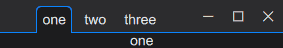
Each time a user activates the toolbar tab button it switches its state to 'on'.
A toolbar tab button cannot itself switch state to 'other', this state may be caused by external factors. The canonical example is another toolbar tab button in a set, which is configured with a different on_value.
In the following example we create three toolbar tab button widgets on the window which observes the same value. Each tab button is configured with a different on_value: 0, 1 and 2.
- Note
- A toolbar tab button does not directly control a
tab_widget. Likeradio_button_widgetthis is accomplished by sharing a delegate or a observable between the toolbar tab button and the tab widget.
Constructor & Destructor Documentation
◆ toolbar_tab_button_widget() [1/2]
|
inlinenoexcept |
Construct a toolbar tab button widget.
- Parameters
-
window The window that this widget belongs to. parent The parent widget that owns this radio button widget. label The label to show in the tab button. delegate The delegate to use to manage the state of the tab button widget.
◆ toolbar_tab_button_widget() [2/2]
requires (not std::is_convertible_v<Value, weak_or_unique_ptr<delegate_type>>)
|
inlinenoexcept |
Construct a toolbar tab button widget with a default button delegate.
- See also
- default_button_delegate
- Parameters
-
window The window that this widget belongs to. parent The parent widget that owns this radio button widget. label The label to show in the tab button. value The value or observablevalue which represents the state of the tab button.args An optional on-value. This value is used to determine which value yields an 'on' state.
The documentation for this class was generated from the following file:
- hikogui/src/ttauri/widgets/toolbar_tab_button_widget.hpp