#include <hikogui/widgets/radio_button_widget.hpp>
Public Types | |
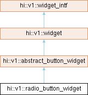
| using | super = abstract_button_widget |
| using | delegate_type = typename super::delegate_type |
| Public Types inherited from hi::v1::abstract_button_widget | |
| using | super = widget |
| using | delegate_type = button_delegate |
Public Member Functions | |
| radio_button_widget (widget *parent, std::shared_ptr< delegate_type > delegate, button_widget_attribute auto &&...attributes) noexcept | |
| Construct a radio button widget. | |
| template<different_from< std::shared_ptr< delegate_type > > Value, forward_of< observer< observer_decay_t< Value > > > OnValue, button_widget_attribute... Attributes> requires requires { make_default_radio_button_delegate(hi_forward(value), hi_forward(on_value)); } | |
| radio_button_widget (widget *parent, Value &&value, OnValue &&on_value, Attributes &&...attributes) noexcept | |
| Construct a radio button widget with a default button delegate. | |
| Public Member Functions inherited from hi::v1::abstract_button_widget | |
| abstract_button_widget (widget *parent, std::shared_ptr< delegate_type > delegate) noexcept | |
| button_state | state () const noexcept |
| Get the current state of the button. | |
| Public Member Functions inherited from hi::v1::widget | |
| widget (widget *parent) noexcept | |
| widget (const widget &)=delete | |
| widget & | operator= (const widget &)=delete |
| widget (widget &&)=delete | |
| widget & | operator= (widget &&)=delete |
| generator< widget_intf & > | children (bool include_invisible) noexcept override |
| Get a list of child widgets. | |
| hitbox | hitbox_test (point2 position) const noexcept override |
| Find the widget that is under the mouse cursor. | |
| virtual hitbox | hitbox_test_from_parent (point2 position) const noexcept |
| Call hitbox_test from a parent widget. | |
| virtual hitbox | hitbox_test_from_parent (point2 position, hitbox sibling_hitbox) const noexcept |
| Call hitbox_test from a parent widget. | |
| bool | accepts_keyboard_focus (keyboard_focus_group group) const noexcept override |
| Check if the widget will accept keyboard focus. | |
| box_constraints | update_constraints () noexcept override |
| Update the constraints of the widget. | |
| void | set_layout (widget_layout const &context) noexcept override |
| Update the internal layout of the widget. | |
| widget_layout const & | layout () const noexcept override |
| Get the current layout for this widget. | |
| void | draw (draw_context const &context) noexcept override |
| Draw the widget. | |
| bool | process_event (gui_event const &event) const noexcept override |
| Send a event to the window. | |
| void | request_redraw () const noexcept override |
| Request the widget to be redrawn on the next frame. | |
| bool | handle_event (gui_event const &event) noexcept override |
| Handle command. | |
| bool | handle_event_recursive (gui_event const &event, std::vector< widget_id > const &reject_list=std::vector< widget_id >{}) noexcept override |
| Handle command recursive. | |
| virtual widget_id | find_next_widget (widget_id current_keyboard_widget, keyboard_focus_group group, keyboard_focus_direction direction) const noexcept override |
| Find the next widget that handles keyboard focus. | |
| widget_id | find_first_widget (keyboard_focus_group group) const noexcept override |
| widget_id | find_last_widget (keyboard_focus_group group) const noexcept override |
| bool | is_first (keyboard_focus_group group) const noexcept |
| Is this widget the first widget in the parent container. | |
| bool | is_last (keyboard_focus_group group) const noexcept |
| Is this widget the last widget in the parent container. | |
| void | scroll_to_show (hi::aarectangle rectangle) noexcept override |
| Scroll to show the given rectangle on the window. | |
| void | set_window (gui_window *window) noexcept override |
| Set the window for this tree of widgets. | |
| gui_window * | window () const noexcept override |
| Get the window that the widget is owned by. | |
| hi::theme const & | theme () const noexcept |
| gfx_surface const * | surface () const noexcept |
| virtual color | foreground_color () const noexcept |
| virtual color | focus_color () const noexcept |
| virtual color | accent_color () const noexcept |
| virtual color | label_color () const noexcept |
| virtual generator< widget_intf const & > | children (bool include_invisible) const noexcept final |
| Get a list of child widgets. | |
| void | scroll_to_show () noexcept |
| Scroll to show the important part of the widget. | |
| Public Member Functions inherited from hi::v1::widget_intf | |
| widget_intf (widget_intf *parent) noexcept | |
| std::vector< widget_id > | parent_chain () const noexcept |
| Get a list of parents of a given widget. | |
| void | scroll_to_show () noexcept |
| Scroll to show the important part of the widget. | |
Additional Inherited Members | |
| Data Fields inherited from hi::v1::abstract_button_widget | |
| std::shared_ptr< delegate_type > | delegate |
| The delegate that controls the button widget. | |
| observer< label > | on_label = txt("on") |
| The label to show when the button is in the 'on' state. | |
| observer< label > | off_label = txt("off") |
| The label to show when the button is in the 'off' state. | |
| observer< label > | other_label = txt("other") |
| The label to show when the button is in the 'other' state. | |
| observer< alignment > | alignment |
| The alignment of the button and on/off/other label. | |
| observer< semantic_text_style > | text_style = semantic_text_style::label |
| The text style to button's label. | |
| notifier< void()> | pressed |
| Data Fields inherited from hi::v1::widget | |
| observer< widget_mode > | mode = widget_mode::enabled |
| The widget mode. | |
| observer< bool > | hover = false |
| Mouse cursor is hovering over the widget. | |
| observer< bool > | focus = false |
| The widget has keyboard focus. | |
| int | semantic_layer = 0 |
| The draw layer of the widget. | |
| int | logical_layer = 0 |
| The logical layer of the widget. | |
| observer< extent2 > | minimum = extent2{} |
| The minimum size this widget is allowed to be. | |
| observer< extent2 > | maximum = extent2::large() |
| The maximum size this widget is allowed to be. | |
| Data Fields inherited from hi::v1::widget_intf | |
| widget_id | id = {} |
| The numeric identifier of a widget. | |
| widget_intf * | parent = nullptr |
| Pointer to the parent widget. | |
Detailed Description
A graphical control element that allows the user to choose only one of a predefined set of mutually exclusive options.
A radio-button has two different states with different visual representation:
- on: The radio button shows a solid circle inside it
- other: The radio button shows empty.
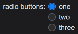
Each time a user activates the radio-button it switches its state to 'on'.
A radio button cannot itself switch state to 'other', this state may be caused by external factors. The canonical example is another radio button in a set, which is configured with a different on_value.
In the following example we create three radio button widgets on the window which observes the same value. Each radio button is configured with a different on_value: 1, 2 and 3. Initially the value is 0, and therefor none of the radio buttons is selected when the application is started.
- Note
- Unlike some other GUI toolkits a radio button is a singular widget. Multiple radio buttons may share a delegate or an observer which allows radio buttons to act as a set.
Constructor & Destructor Documentation
◆ radio_button_widget() [1/2]
|
inlinenoexcept |
Construct a radio button widget.
- Parameters
-
parent The parent widget that owns this radio button widget. delegate The delegate to use to manage the state of the radio button. attributes Different attributes used to configure the label's on the radio button: a label, alignment or semantic_text_style. If one label is passed it will be shown in all states. If two labels are passed the first label is shown in on-state and the second for off-state.
◆ radio_button_widget() [2/2]
requires requires { make_default_radio_button_delegate(hi_forward(value), hi_forward(on_value)); }
|
inlinenoexcept |
Construct a radio button widget with a default button delegate.
- Parameters
-
parent The parent widget that owns this radio button widget. value The value or observer value which represents the state of the radio button. on_value An optional on-value. This value is used to determine which value yields an 'on' state. attributes Different attributes used to configure the label's on the radio button: a label, alignment or semantic_text_style. If one label is passed it will be shown in all states. If two labels are passed the first label is shown in on-state and the second for off-state.
The documentation for this class was generated from the following file:
- hikogui/src/hikogui/widgets/radio_button_widget.hpp
Generated on for HikoGUI by
 1.16.1