#include <hikogui/widgets/label_widget.hpp>
Inheritance diagram for hi::v1::label_widget< Name >:
Public Types | |
| using | super = widget |
 Public Types inherited from hi::v1::widget Public Types inherited from hi::v1::widget | |
| using | callback_token = notifier<void()>::callback_token |
| using | awaiter_type = notifier<void()>::awaiter_type |
Public Member Functions | |
| label_widget (widget *parent, label_widget_attribute auto &&...attributes) noexcept | |
| Construct a label widget. | |
| Public Member Functions inherited from hi::v1::widget | |
| widget (widget *parent) noexcept | |
| widget (widget const &)=delete | |
| widget (widget &&)=delete | |
| widget & | operator= (widget &&)=delete |
| widget & | operator= (widget const &)=delete |
| generator< widget & > | children (bool include_invisible) noexcept |
| virtual hitbox | hitbox_test_from_parent (point2i position) const noexcept |
| Call hitbox_test from a parent widget. | |
| virtual hitbox | hitbox_test_from_parent (point2i position, hitbox sibling_hitbox) const noexcept |
| Call hitbox_test from a parent widget. | |
| virtual bool | accepts_keyboard_focus (keyboard_focus_group group) const noexcept |
| Check if the widget will accept keyboard focus. | |
| void | reset_layout (gfx_surface *new_surface, float new_scale) noexcept |
| Reset the layout. | |
| virtual sub_theme_selector_type | sub_theme_selector () const noexcept |
| virtual bool | process_event (gui_event const &event) const noexcept |
| virtual void | request_redraw () const noexcept |
| Request the widget to be redrawn on the next frame. | |
| virtual bool | handle_event (gui_event const &event) noexcept |
| Handle command. | |
| virtual bool | handle_event_recursive (gui_event const &event, std::vector< widget_id > const &reject_list=std::vector< widget_id >{}) noexcept |
| Handle command recursive. | |
| virtual widget_id | find_next_widget (widget_id current_keyboard_widget, keyboard_focus_group group, keyboard_focus_direction direction) const noexcept |
| Find the next widget that handles keyboard focus. | |
| widget_id | find_first_widget (keyboard_focus_group group) const noexcept |
| widget_id | find_last_widget (keyboard_focus_group group) const noexcept |
| bool | is_first (keyboard_focus_group group) const noexcept |
| bool | is_last (keyboard_focus_group group) const noexcept |
| virtual void | scroll_to_show (hi::aarectanglei rectangle) noexcept |
| Scroll to show the given rectangle on the window. | |
| std::vector< widget_id > | parent_chain () const noexcept |
| Get a list of parents of a given widget. | |
| virtual bool | is_tab_button () const noexcept |
| Check if this widget is a tab-button. | |
| template<forward_of< void()> Callback> | |
| callback_token | subscribe (Callback &&callback, callback_flags flags=callback_flags::synchronous) const noexcept |
| awaiter_type | operator co_await () const noexcept |
Data Fields | |
| observer< label > | label |
| The label to display. | |
| observer< alignment > | alignment = hi::alignment::top_flush() |
| How the label and icon are aligned. | |
| Data Fields inherited from hi::v1::widget | |
| widget_id | id = {} |
| The numeric identifier of a widget. | |
| widget * | parent = nullptr |
| Pointer to the parent widget. | |
| gfx_surface * | surface = nullptr |
| The surface this widget is drawn on. | |
| observer< widget_mode > | mode = widget_mode::enabled |
| The widget mode. | |
| observer< bool > | hover = false |
| Mouse cursor is hovering over the widget. | |
| observer< bool > | clicked = false |
| The widget is being clicked by the mouse. | |
| observer< bool > | focus = false |
| The widget has keyboard focus. | |
| observer< widget_state > | state = widget_state::off |
| The state of the widget. | |
| size_t | semantic_layer = 0_uz |
| The draw layer of the widget. | |
| observer< extent2i > | minimum = extent2i{} |
| The minimum size this widget is allowed to be. | |
| observer< extent2i > | maximum = extent2i::large() |
| The maximum size this widget is allowed to be. | |
| widget_layout | layout |
Static Public Attributes | |
| static constexpr auto | prefix = Name / "label" |
Detailed Description
template<fixed_string Name = "">
class hi::v1::label_widget< Name >
class hi::v1::label_widget< Name >
The GUI widget displays and lays out text together with an icon.
This widget is often used by other widgets. For example checkboxes display a label representing their state next to the checkbox itself.
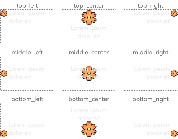
The alignment of icon and text is shown in the following image:
Here is an example on how to create a label:
Constructor & Destructor Documentation
◆ label_widget()
template<fixed_string Name = "">
|
inlinenoexcept |
Construct a label widget.
- See also
label_widget::alignment
- Parameters
-
parent The parent widget that owns this radio button widget. attributes Different attributes used to configure the label widget: a label,alignmentortext_theme
Field Documentation
◆ alignment
template<fixed_string Name = "">
| observer<alignment> hi::v1::label_widget< Name >::alignment = hi::alignment::top_flush() |
How the label and icon are aligned.
Different layouts:
alignment::top_left: icon and text are inline with each other, with the icon in the top-left corner.alignment::top_right: icon and text are inline with each other, with the icon in the top-right corner.alignment::middle_left: icon and text are inline with each other, with the icon in the middle-left.alignment::middle_right: icon and text are inline with each other, with the icon in the middle-right.alignment::bottom_left: icon and text are inline with each other, with the icon in the bottom-left.alignment::bottom_right: icon and text are inline with each other, with the icon in the bottom-right.alignment::top_center: Larger icon above the text, both center aligned.alignment::bottom_center: Larger icon below the text, both center aligned. used with apixmapicon.
◆ label
template<fixed_string Name = "">
| observer<label> hi::v1::label_widget< Name >::label |
The label to display.
The documentation for this class was generated from the following file:
- hikogui/src/hikogui/widgets/label_widget.hpp