#include <hikogui/widgets/selection_widget.hpp>
Public Types | |
| using | super = widget |
| using | delegate_type = selection_delegate |
Public Member Functions | |
| selection_widget (widget *parent, std::shared_ptr< delegate_type > delegate) noexcept | |
| Construct a selection widget with a delegate. | |
| selection_widget (widget *parent, std::shared_ptr< delegate_type > delegate, selection_widget_attribute auto &&first_attribute, selection_widget_attribute auto &&...attributes) noexcept | |
| Construct a selection widget with a delegate. | |
| template<different_from< std::shared_ptr< delegate_type > > Value, forward_of< observer< std::vector< std::pair< observer_decay_t< Value >, label > > > > OptionList, selection_widget_attribute... Attributes> requires requires { make_default_selection_delegate(hi_forward(value), hi_forward(option_list)); } | |
| selection_widget (widget *parent, Value &&value, OptionList &&option_list, Attributes &&...attributes) noexcept | |
| Construct a selection widget which will monitor an option list and a value. | |
| template<different_from< std::shared_ptr< delegate_type > > Value, forward_of< observer< std::vector< std::pair< observer_decay_t< Value >, label > > > > OptionList, forward_of< observer< observer_decay_t< Value > > > OffValue, selection_widget_attribute... Attributes> requires requires { make_default_selection_delegate(hi_forward(value), hi_forward(option_list), hi_forward(off_value)); } | |
| selection_widget (widget *parent, Value &&value, OptionList &&option_list, OffValue &&off_value, Attributes &&...attributes) noexcept | |
| Construct a selection widget which will monitor an option list and a value. | |
 Public Member Functions inherited from hi::v1::widget Public Member Functions inherited from hi::v1::widget | |
| widget (widget *parent) noexcept | |
| widget (const widget &)=delete | |
| widget & | operator= (const widget &)=delete |
| widget (widget &&)=delete | |
| widget & | operator= (widget &&)=delete |
| virtual hitbox | hitbox_test_from_parent (point3 position) const noexcept |
| Call hitbox_test from a parent widget. | |
| virtual hitbox | hitbox_test_from_parent (point3 position, hitbox sibling_hitbox) const noexcept |
| Call hitbox_test from a parent widget. | |
| widget_constraints const & | constraints () const noexcept |
| widget_layout const & | layout () const noexcept |
| Get the current layout for this widget. | |
| virtual bool | process_event (gui_event const &event) const noexcept |
| void | request_redraw () const noexcept |
| Request the widget to be redrawn on the next frame. | |
| virtual bool | handle_event_recursive (gui_event const &event, std::vector< widget const * > const &reject_list=std::vector< widget const * >{}) noexcept |
| Handle command recursive. | |
| virtual widget const * | find_next_widget (widget const *current_keyboard_widget, keyboard_focus_group group, keyboard_focus_direction direction) const noexcept |
| Find the next widget that handles keyboard focus. | |
| widget const * | find_first_widget (keyboard_focus_group group) const noexcept |
| widget const * | find_last_widget (keyboard_focus_group group) const noexcept |
| bool | is_first (keyboard_focus_group group) const noexcept |
| Is this widget the first widget in the parent container. | |
| bool | is_last (keyboard_focus_group group) const noexcept |
| Is this widget the last widget in the parent container. | |
| virtual void | scroll_to_show (hi::aarectangle rectangle) noexcept |
| Scroll to show the given rectangle on the window. | |
| void | scroll_to_show () noexcept |
| Scroll to show the important part of the widget. | |
| std::vector< widget const * > | parent_chain () const noexcept |
| Get a list of parents of a given widget. | |
| virtual color | background_color () const noexcept |
| virtual color | foreground_color () const noexcept |
| virtual color | accent_color () const noexcept |
| virtual color | label_color () const noexcept |
Data Fields | |
| std::shared_ptr< delegate_type > | delegate |
| observer< label > | off_label |
| The label to show when nothing is selected. | |
| observer< alignment > | alignment = hi::alignment::top_right() |
| How the label and icon are aligned. | |
| observer< semantic_text_style > | text_style = semantic_text_style::label |
| The text style to display the label's text in and color of the label's (non-color) icon. | |
| Data Fields inherited from hi::v1::widget | |
| widget * | parent |
| Pointer to the parent widget. | |
| std::string | id |
| A name of widget, should be unique between siblings. | |
| observer< widget_mode > | mode = widget_mode::enabled |
| The widget mode. | |
| observer< bool > | hover = false |
| Mouse cursor is hovering over the widget. | |
| observer< bool > | focus = false |
| The widget has keyboard focus. | |
| int | semantic_layer |
| The draw layer of the widget. | |
| int | logical_layer |
| The logical layer of the widget. | |
Detailed Description
A graphical control element that allows the user to choose only one of a predefined set of mutually exclusive options.
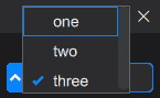
The following example creates a selection widget with three options. which will monitor and modify value to display the options from the option_list. At application startup, value is zero and none of the options is selected:
Constructor & Destructor Documentation
◆ selection_widget() [1/4]
|
noexcept |
Construct a selection widget with a delegate.
- Parameters
-
parent The owner of the selection widget. delegate The delegate which will control the selection widget.
◆ selection_widget() [2/4]
|
inlinenoexcept |
Construct a selection widget with a delegate.
- Parameters
-
parent The owner of the selection widget. delegate The delegate which will control the selection widget. first_attribute First of attributes. attributes Different attributes used to configure the label's on the selection box: a label,alignmentorsemantic_text_style. If an label is passed it is used as the label to show in the off-state.
◆ selection_widget() [3/4]
requires requires { make_default_selection_delegate(hi_forward(value), hi_forward(option_list)); }
|
inlinenoexcept |
Construct a selection widget which will monitor an option list and a value.
- Parameters
-
parent The owner of the selection widget. value The value or observer value to monitor. option_list An vector or an observer vector of pairs of keys and labels. The keys are of the same type as the value. The labels are of type label.attributes Different attributes used to configure the label's on the selection box: a label,alignmentorsemantic_text_style. If an label is passed it is used as the label to show in the off-state.
◆ selection_widget() [4/4]
requires requires { make_default_selection_delegate(hi_forward(value), hi_forward(option_list), hi_forward(off_value)); }
|
inlinenoexcept |
Construct a selection widget which will monitor an option list and a value.
- Parameters
-
parent The owner of the selection widget. value The value or observer value to monitor. option_list An vector or an observer vector of pairs of keys and labels. The keys are of the same type as the value. The labels are of type label.off_value An optional off-value. This value is used to determine which value yields an 'off' state. attributes Different attributes used to configure the label's on the selection box: a label,alignmentorsemantic_text_style. If an label is passed it is used as the label to show in the off-state.
Field Documentation
◆ alignment
| observer<alignment> hi::v1::selection_widget::alignment = hi::alignment::top_right() |
How the label and icon are aligned.
Different layouts:
alignment::top_left: icon and text are inline with each other, with the icon in the top-left corner.alignment::top_right: icon and text are inline with each other, with the icon in the top-right corner.alignment::middle_left: icon and text are inline with each other, with the icon in the middle-left.alignment::middle_right: icon and text are inline with each other, with the icon in the middle-right.alignment::bottom_left: icon and text are inline with each other, with the icon in the bottom-left.alignment::bottom_right: icon and text are inline with each other, with the icon in the bottom-right.alignment::top_center: Larger icon above the text, both center aligned.alignment::bottom_center: Larger icon below the text, both center aligned.alignment::middle_center: text drawn across a large icon. Should only be used with apixmapicon.
◆ off_label
| observer<label> hi::v1::selection_widget::off_label |
The label to show when nothing is selected.
◆ text_style
| observer<semantic_text_style> hi::v1::selection_widget::text_style = semantic_text_style::label |
The text style to display the label's text in and color of the label's (non-color) icon.
The documentation for this class was generated from the following file:
- hikogui/src/hikogui/widgets/selection_widget.hpp